

Excellence in Business Communication, 13th Edition
Chapter 12. Planning Reports and Proposals
"There’s more information at your fingertips than ever before, and yet people are overwhelmed by it.
Teaching oral communication on Pinterest.
This collection of resources for business communication and business writing instructors focus on a wide variety of media, including videos, infographics, PowerPoints, PDFs, and podcasts, covering every relevant topic so you can keep your course fresh and up to date.
Randy Krum features an infographic on the topic.
Check out a Pinterest page of data visualizations.
"Think you're an expert at Googling?
"Imagine not being able to recognize your mother, your spouse or your own children.
In this CommPro.
These online tools (many are free) offer a variety of ways to create infographics.
"If you or your CEO has been called upon by a TV news reporter to comment on a mass layoff, product recall or other urgent news situation, you know the feeling that this old Wide World of Sports adage can evoke: 'The thrill of victory and the agony of defeat,'" writes Gwen Chynoweth (photo, left).
Anthony Dejolde shares an infographic on the topic of "googling like a boss.
"Like many designers," writes NYTimes staff writer Quentin Hardy, "Eric Rodenbeck (photo, left) has had a long relationship with bar graphs and pie charts.
"Melitta Campbell (photo, left) is a copywriter with 15 years experience of working in a corporate communications environment within a number of international organisations.
Effective communication is everyone’s job—whether you are trying to sell in a concept or convince a client.

How to determine how much salary a position will pay .
When writing online, how can you appeal to readers’ emotions on a business-oriented site?
Ramona Emerson (photo, left) recently wrote about Google's Verbatim.
Here's an infographic on how, when, and where people share content.
Ever wonder about the work of a website's or blog's comment moderator?
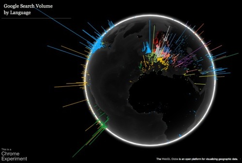
Ever wanted a cool way to see how many people were searching in what different languages in each part of the world?
Ever wanted a cool way to see how many people were searching in what different languages in each part of the world?
Data visualization is a method of presenting information in a graphical form.
David McCandless makes infographics -- simple, elegant ways to see information that might be too complex or too big, small, abstract or scattered to otherwise be grasped.
Google Goggles is a visual search app for Android phones.
Infographics are a popular way to illustrate information, especially for print publications.