
Business Communication Essentials, 7th Ed.
Chapter 11. Writing and Completing Reports and Proposals
In this CommPro.
"SMS remains the most useful engagement tool on mobile, followed by QR codes, two-way SMS and push notifications according to this new infographic.
"We’ve all seen it.
View original content
Fudging details will hurt you in the long run.
These online tools (many are free) offer a variety of ways to create infographics.
This PowerPoint presentation offers helpful tips for avoiding plagiarism when researching and writing reports.
More and more companies rely on the social web to influence customers before the sale and support them after; these statistics explain why social help is becoming so pervasive.
"So we’re taking a stand here," begins Terry Heick, director at TeachThought.
"Like many designers," writes NYTimes staff writer Quentin Hardy, "Eric Rodenbeck (photo, left) has had a long relationship with bar graphs and pie charts.
"Melitta Campbell (photo, left) is a copywriter with 15 years experience of working in a corporate communications environment within a number of international organisations.
Effective communication is everyone’s job—whether you are trying to sell in a concept or convince a client.
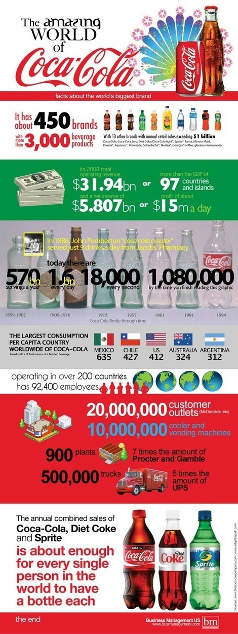
The amazing world of Coca-Cola via an infographic.
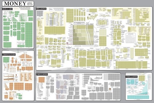
The Money Chart from Randall Munroe’s webcomic xkcd.

Fudging details will hurt you in the long run.
When writing online, how can you appeal to readers’ emotions on a business-oriented site?
Written by a non-statistician in hokey language and illustrated by humorous line drawings, How To Lie With Statistics is as relevant and enjoyable as when it first appeared in 1954.
Here's an infographic on how, when, and where people share content.
Ever wonder about the work of a website's or blog's comment moderator?
Data visualization is a method of presenting information in a graphical form.
David McCandless makes infographics -- simple, elegant ways to see information that might be too complex or too big, small, abstract or scattered to otherwise be grasped.
Infographics are a popular way to illustrate information, especially for print publications.
When we get graphs as graphics from other sources, we think there is nothing we can do with them.
This PowerPoint presentation offers helpful tips for avoiding plagiarism when researching and writing reports.