

Excellence in Business Communication, 13th Edition
Chapter 12. Planning Reports and Proposals
These online tools (many are free) offer a variety of ways to create infographics.
More and more companies rely on the social web to influence customers before the sale and support them after; these statistics explain why social help is becoming so pervasive.
"So we’re taking a stand here," begins Terry Heick, director at TeachThought.
"If you or your CEO has been called upon by a TV news reporter to comment on a mass layoff, product recall or other urgent news situation, you know the feeling that this old Wide World of Sports adage can evoke: 'The thrill of victory and the agony of defeat,'" writes Gwen Chynoweth (photo, left).
Anthony Dejolde shares an infographic on the topic of "googling like a boss.
"Like many designers," writes NYTimes staff writer Quentin Hardy, "Eric Rodenbeck (photo, left) has had a long relationship with bar graphs and pie charts.
"Melitta Campbell (photo, left) is a copywriter with 15 years experience of working in a corporate communications environment within a number of international organisations.
Effective communication is everyone’s job—whether you are trying to sell in a concept or convince a client.
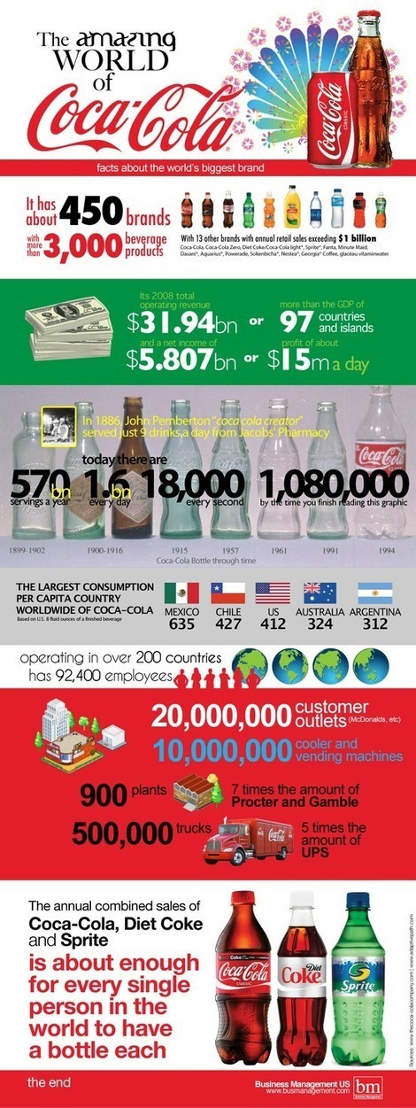
The amazing world of Coca-Cola via an infographic.

How to determine how much salary a position will pay .
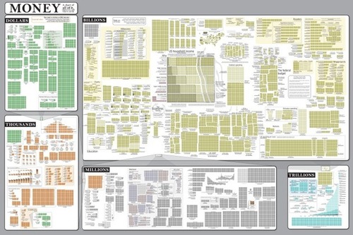
The Money Chart from Randall Munroe’s webcomic xkcd.
When writing online, how can you appeal to readers’ emotions on a business-oriented site?
Ramona Emerson (photo, left) recently wrote about Google's Verbatim.
Here's an infographic on how, when, and where people share content.
Ever wonder about the work of a website's or blog's comment moderator?
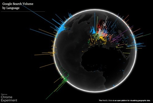
Ever wanted a cool way to see how many people were searching in what different languages in each part of the world?
Ever wanted a cool way to see how many people were searching in what different languages in each part of the world?
Data visualization is a method of presenting information in a graphical form.
David McCandless makes infographics -- simple, elegant ways to see information that might be too complex or too big, small, abstract or scattered to otherwise be grasped.
Google Goggles is a visual search app for Android phones.
Infographics are a popular way to illustrate information, especially for print publications.
When we get graphs as graphics from other sources, we think there is nothing we can do with them.
A simple procedure for setting up an RSS aggregator.