

Excellence in Business Communication, 13th Edition
Chapter 12. Planning Reports and Proposals
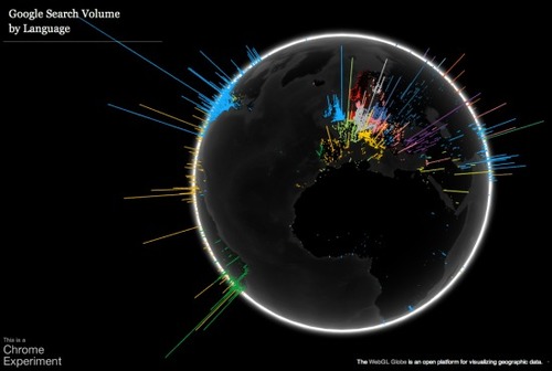
Ever wanted a cool way to see how many people were searching in what different languages in each part of the world?
Ever wanted a cool way to see how many people were searching in what different languages in each part of the world?
Data visualization is a method of presenting information in a graphical form.
David McCandless makes infographics -- simple, elegant ways to see information that might be too complex or too big, small, abstract or scattered to otherwise be grasped.
Google Goggles is a visual search app for Android phones.
Infographics are a popular way to illustrate information, especially for print publications.
When we get graphs as graphics from other sources, we think there is nothing we can do with them.
A simple procedure for setting up an RSS aggregator.
AnnualCreditReport.
Don’t limit yourself to familiar career choices—explore the full range at this comprehensive website.