
Excellence in Business Communication, 11th Edition
Chapter 12. Writing Reports and Proposals
View original content
Check out a Pinterest page of data visualizations.
In this CommPro.
Chapter 14 Message 14B
Download and watch this presentation in slide show mode.
Revise these slides to make the text more effective for presentation purposes.
Fudging details will hurt you in the long run.
These online tools (many are free) offer a variety of ways to create infographics.
This PowerPoint presentation offers helpful tips for avoiding plagiarism when researching and writing reports.
"If you or your CEO has been called upon by a TV news reporter to comment on a mass layoff, product recall or other urgent news situation, you know the feeling that this old Wide World of Sports adage can evoke: 'The thrill of victory and the agony of defeat,'" writes Gwen Chynoweth (photo, left).
"Like many designers," writes NYTimes staff writer Quentin Hardy, "Eric Rodenbeck (photo, left) has had a long relationship with bar graphs and pie charts.
"Melitta Campbell (photo, left) is a copywriter with 15 years experience of working in a corporate communications environment within a number of international organisations.
Effective communication is everyone’s job—whether you are trying to sell in a concept or convince a client.

Fudging details will hurt you in the long run.
When writing online, how can you appeal to readers’ emotions on a business-oriented site?
Written by a non-statistician in hokey language and illustrated by humorous line drawings, How To Lie With Statistics is as relevant and enjoyable as when it first appeared in 1954.
Here's an infographic on how, when, and where people share content.
Ever wonder about the work of a website's or blog's comment moderator?
Revise these slides to make the text more effective for presentation purposes.
These concepts will help make you a better listener on the job and in every other aspect of life.
Data visualization is a method of presenting information in a graphical form.
David McCandless makes infographics -- simple, elegant ways to see information that might be too complex or too big, small, abstract or scattered to otherwise be grasped.
Infographics are a popular way to illustrate information, especially for print publications.
When we get graphs as graphics from other sources, we think there is nothing we can do with them.
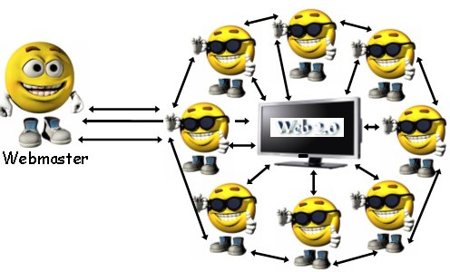
This 36-slide, illustrated presentation explains the difference between Web 1.