
Business Communication Today, 14th Ed.
Chapter 9. Visual Media
Jennifer Frost, with GrammarCheck.
Teaching oral communication on Pinterest.
This collection of resources for business communication and business writing instructors focus on a wide variety of media, including videos, infographics, PowerPoints, PDFs, and podcasts, covering every relevant topic so you can keep your course fresh and up to date.
Randy Krum features an infographic on the topic.
Work4Labs has created an infographic named "Mobile Recruiting by the (Surprising) Numbers.
Check out a Pinterest page of data visualizations.
"Let’s take a look at the top social media brands as if it was a game of SNAKES and LADDERS.
"Imagine not being able to recognize your mother, your spouse or your own children.
In this CommPro.
"SMS remains the most useful engagement tool on mobile, followed by QR codes, two-way SMS and push notifications according to this new infographic.
"We’ve all seen it.
View original content
This website offers a wealth of advice on producing quality videos.
These online tools (many are free) offer a variety of ways to create infographics.
More and more companies rely on the social web to influence customers before the sale and support them after; these statistics explain why social help is becoming so pervasive.
"So we’re taking a stand here," begins Terry Heick, director at TeachThought.
"If you or your CEO has been called upon by a TV news reporter to comment on a mass layoff, product recall or other urgent news situation, you know the feeling that this old Wide World of Sports adage can evoke: 'The thrill of victory and the agony of defeat,'" writes Gwen Chynoweth (photo, left).
"Like many designers," writes NYTimes staff writer Quentin Hardy, "Eric Rodenbeck (photo, left) has had a long relationship with bar graphs and pie charts.
Effective communication is everyone’s job—whether you are trying to sell in a concept or convince a client.
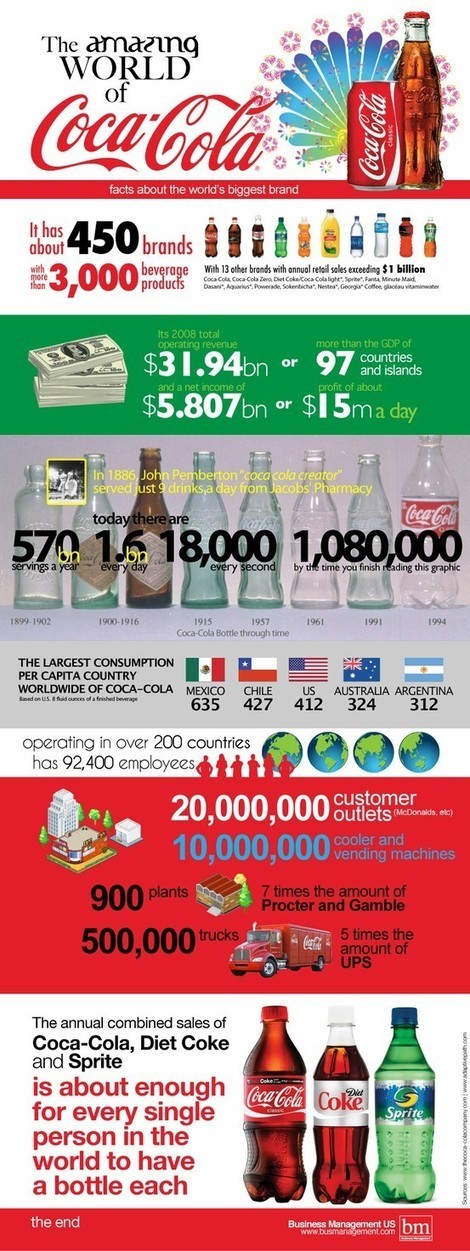
The amazing world of Coca-Cola via an infographic.
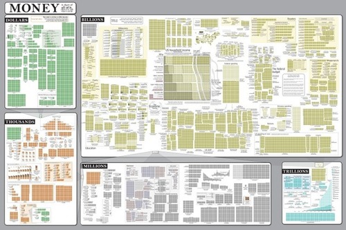
The Money Chart from Randall Munroe’s webcomic xkcd.
Data visualization is a method of presenting information in a graphical form.
David McCandless makes infographics -- simple, elegant ways to see information that might be too complex or too big, small, abstract or scattered to otherwise be grasped.
Infographics are a popular way to illustrate information, especially for print publications.